Nordea’s Website
Task
Nordea Bank (branch in Poland) turned to us with a request to create a new website. Our task was to design and implement a modern and transparent website for their financial operations and IT services.
Results
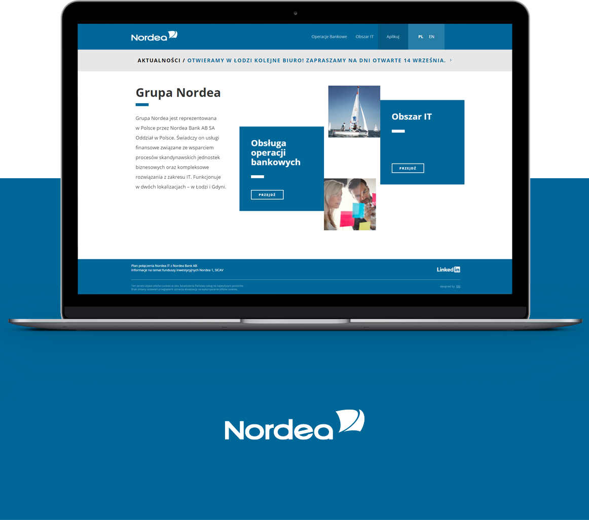
We created a website with an intuitive information architecture which got divided into two main areas - Banking Operations and IT area.
The website got enriched with additional interactive elements, spectacular graphics based on the visual identification of the Nordea group as well as responsive web design technology. The new website also includes additional storytelling which is in line with the character of the Scandinavian lifestyle and its values - WORK-LIFE BALANCE.
WWW i Digital Marketing
Website, Interview, Graphic Design, Responsive Web Design, Content Management System, Copywriting, Google Analytics

Recipients, their needs and goals
In 2013, Nordea Bank AB announced its decision to sell Nordea Bank Poland. Currently on the Polish market Nordea operates as two groups: Banking operations - financial services related to support Scandinavian business units - and the area of IT - which guarantees comprehensive solutions for IT. The new website was primarily designed to act as HR unit - content would be addressed to potential employees.

Functionality and usability
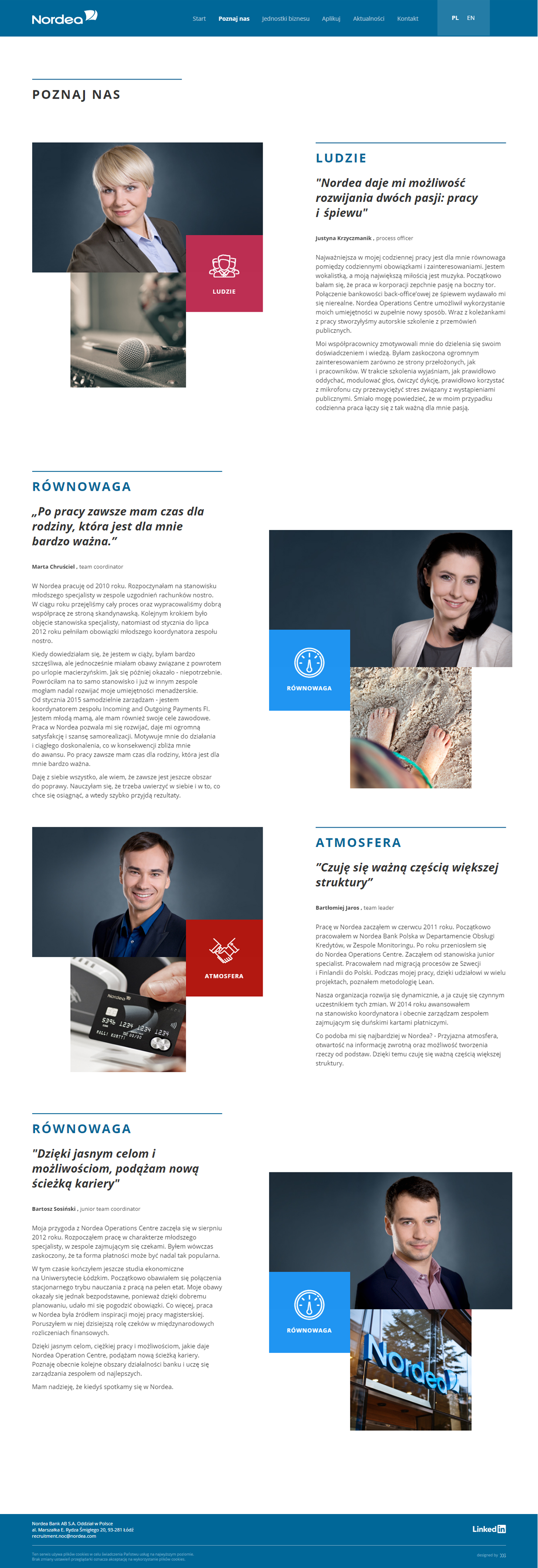
When designing Nordea’s website we have used a range of functionalities which build the image of a credible and reliable employer. We focused on the history of people who work at Nordea, and that alone allowed us to present the atmosphere in the company as well as the Scandinavian work style.. Additionally we created a tab with "News", in which we used a content management system (CMS), as well as the "Apply" tab, integrated with Nordea’s HR system.

Navigation and Information Architecture (IA)
The biggest challenge for our team was to create a clear information architecture including two main divisions of Banking Operations and IT area. We designed the main site www.nordea.pl, to act as an opening platform and redirect for the user who is looking for a detailed information in a particular field.
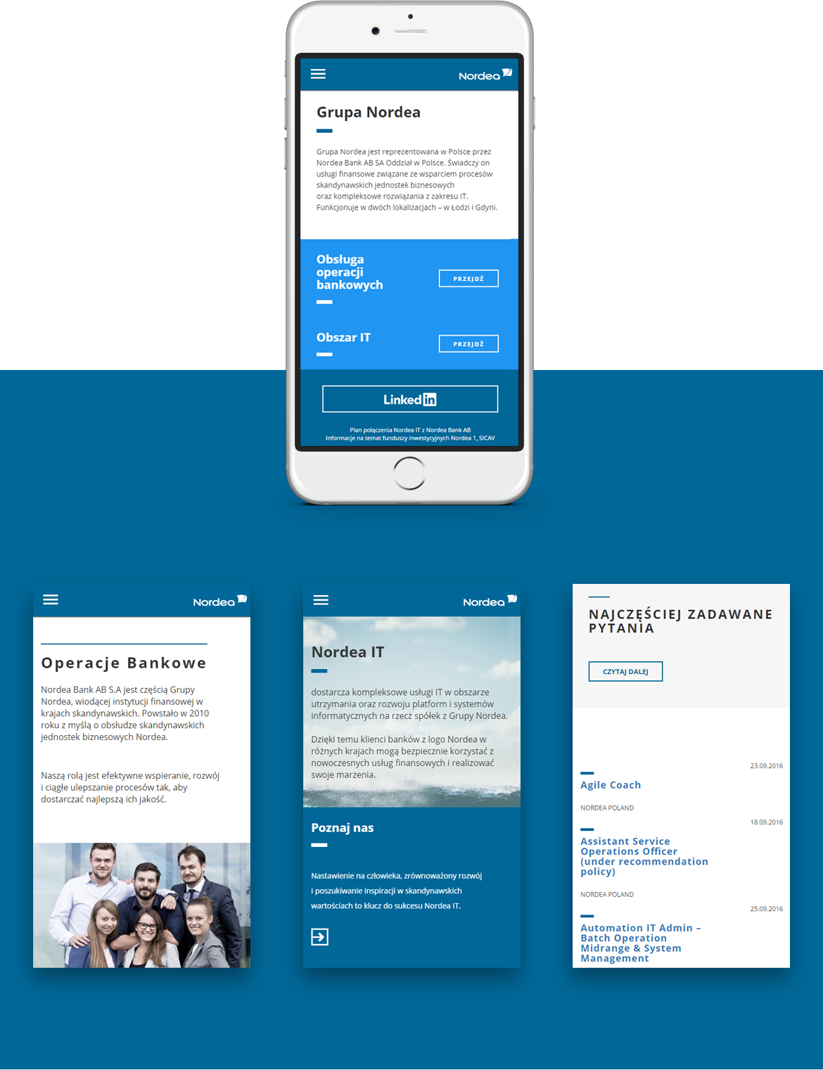
Nordea’s core target audience are young people, like students, developers and programmers .With that in mind we focused on the web browsing experience on mobile devices, as well as the ease and convenience of viewing and applying for jobs.

Interaction and User Interface (UI)
At this stage, we started to work on web mock-ups. While designing the pages as a priority we had intuitive navigation and speed of access to the information in mind. We needed to provide effective and well thought-through UX solutions.
Throughout the testing process we successfully laid out elements such as menu and buttons designed to simplify the navigation for the users.
Content and copywriting
The content of the website was designed to emphasize the values cultivated by Nordea - WORK-LIFE BALANCE. When creating a storytelling we conducted several interviews with Nordea employees. They shared with us their stories related to both, their work at Nordea as well as personal life.
Furthermore in the Nordea IT group we included private photographs of the employees, which additionally authenticated the image of the Nordea group as a brand which is close its employees.
The Look and Feel of the website
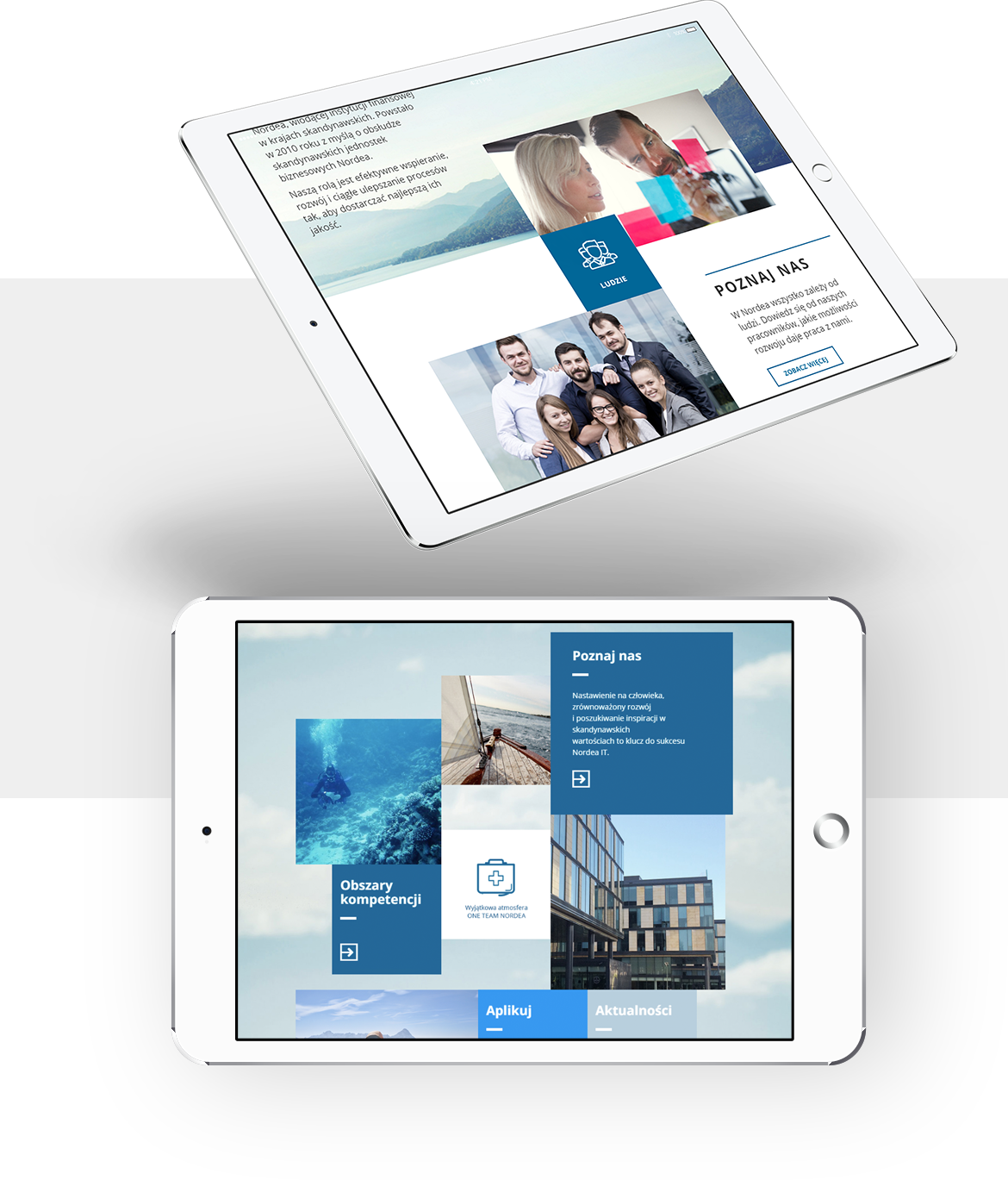
When designing the layout of the new website we were guided by Nordea’s visual identification . The project included additional eye-catching animations and clear and attractive graphics. The site has been developed with mobile devices in mind - thanks to responsive web design, the layout adapts to every smartphone and tablet.

We created an intuitive website with an impressive graphics and numerous interactive elements. The new www.nordea.pl perfectly reflects the character of the Scandinavian work style and successfully attracts the attention of prospective employees.