Scandinavian-style rebranding
Refreshing the corporate image enabled WNS Pomorze to gain new customers in Scandinavia.
Refreshing the corporate image enabled WNS Pomorze to gain new customers in Scandinavia.
Task
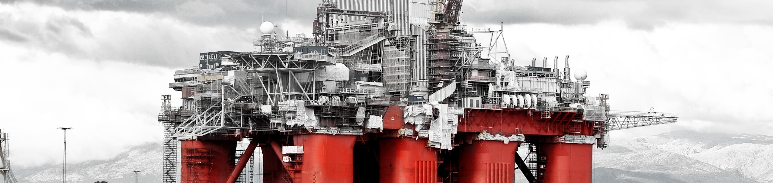
Dynamic development of WNS Pomorze and the aspiration to expand into Scandinavian market created the need to adjust the brand image to its target group and market characteristics. The company faced the challenge to redefine its marketing communication and refresh the image at any point where customers encounter the brand.
Results
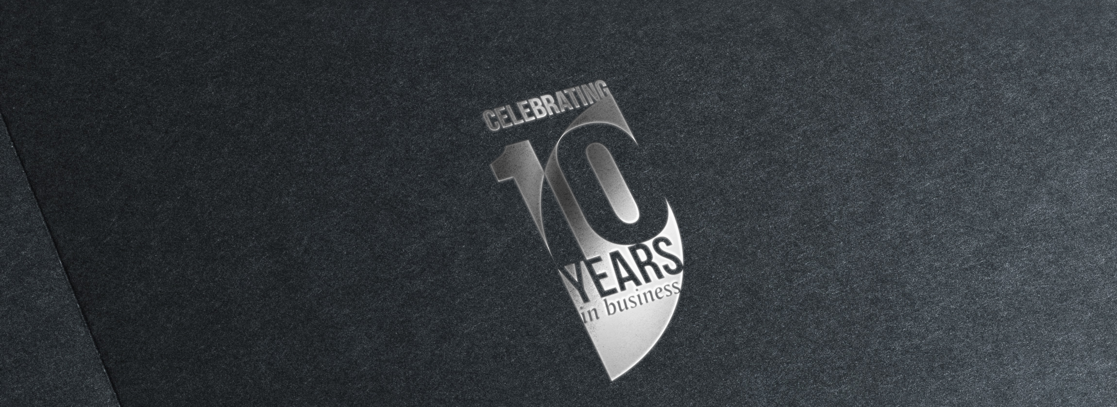
The new communication strategy and visual identity system enabled the company to start active promotion in Scandinavian markets. The new image and the new approach to marketing communication had positive impact on WNS contractors and employees. The rebranding coincided with company’s 10th anniversary.
Creative agency
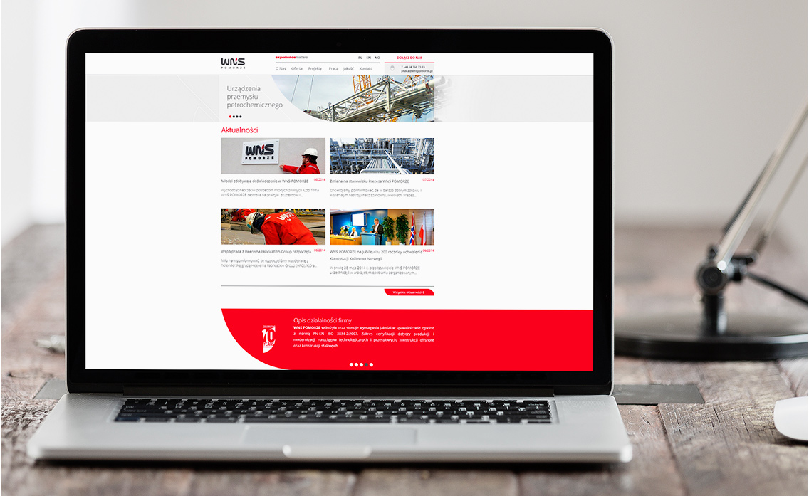
Audit and Brand strategy, Communication strategy, Logo, Visual Identity, Brand Book, Copywriting, Key Visual, Graphic design, BTL production, website
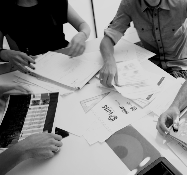
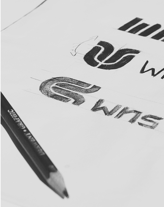
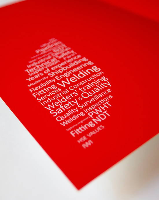
Identifying consumer needs began with auditing the brand and reviewing marketing goals. By creating a detailed communications analysis and assessing competitive advantage and competitive edge, new brand strategy was developed. A set of recommendations was prepared in a document WNS Pomorze Communication Strategy. We developed the new tagline, tone of voice guidelines, definition of a new brand identity including design concepts and choice of media.
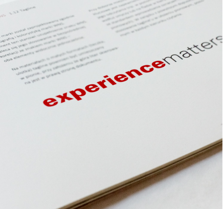
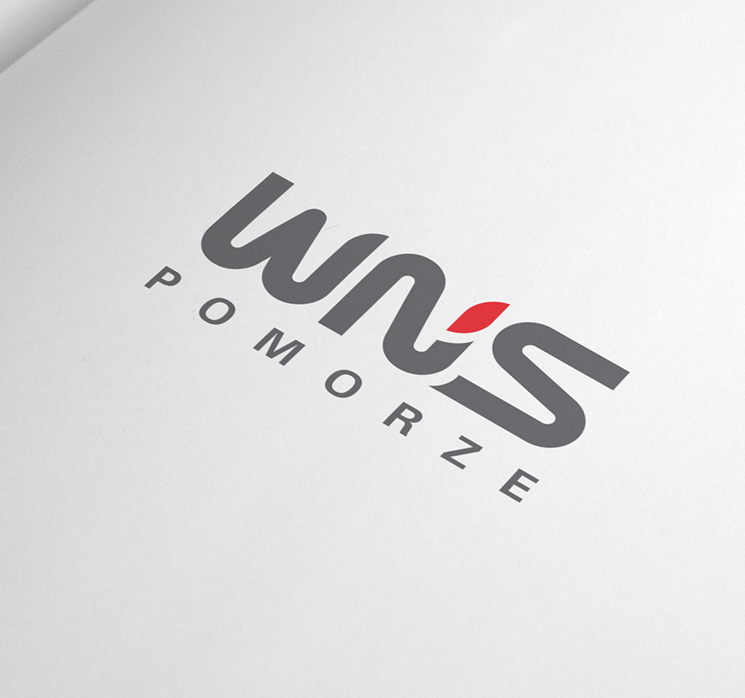
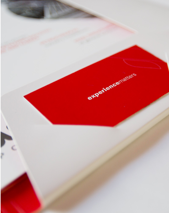
New tagline 'experience matters' is associated with WNS’s highest level of expertise.
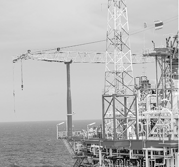
The corporate image reflects the characteristics of its employees - the Key Visual uses the image of a worker and their quoted statement, which features the strengths of the company in an attractive and plausible way.
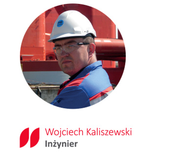
"I've been working as a Site Coordinator for WNS Pomorze for 5 years. The company has many years of experience in the industry, which provides the opportunity to cooperate with the best. At WNS above all we value the professionalism of our colleagues, safety, and a friendly working atmosphere. At WNS we know that experience matters."

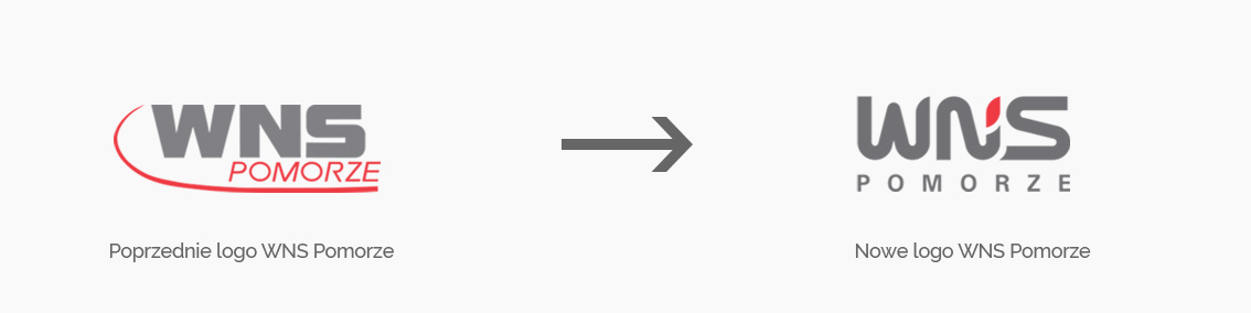
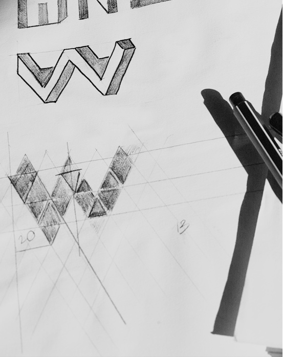
Analysing target group features enabled us to create a completely new brand image, the Scandinavian inspired design concept.
INSPIRATION
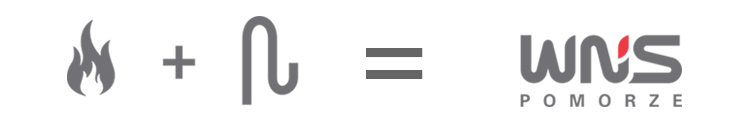
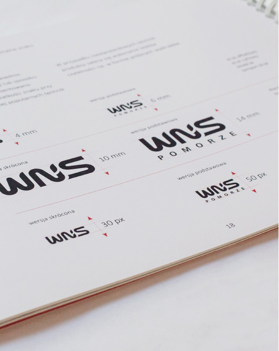
The refreshed logo features key elements consistent with business activity:
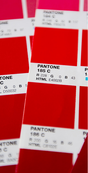
fire - red element in the new logo,
pipe - typographic shape of the logo features steel constructions.
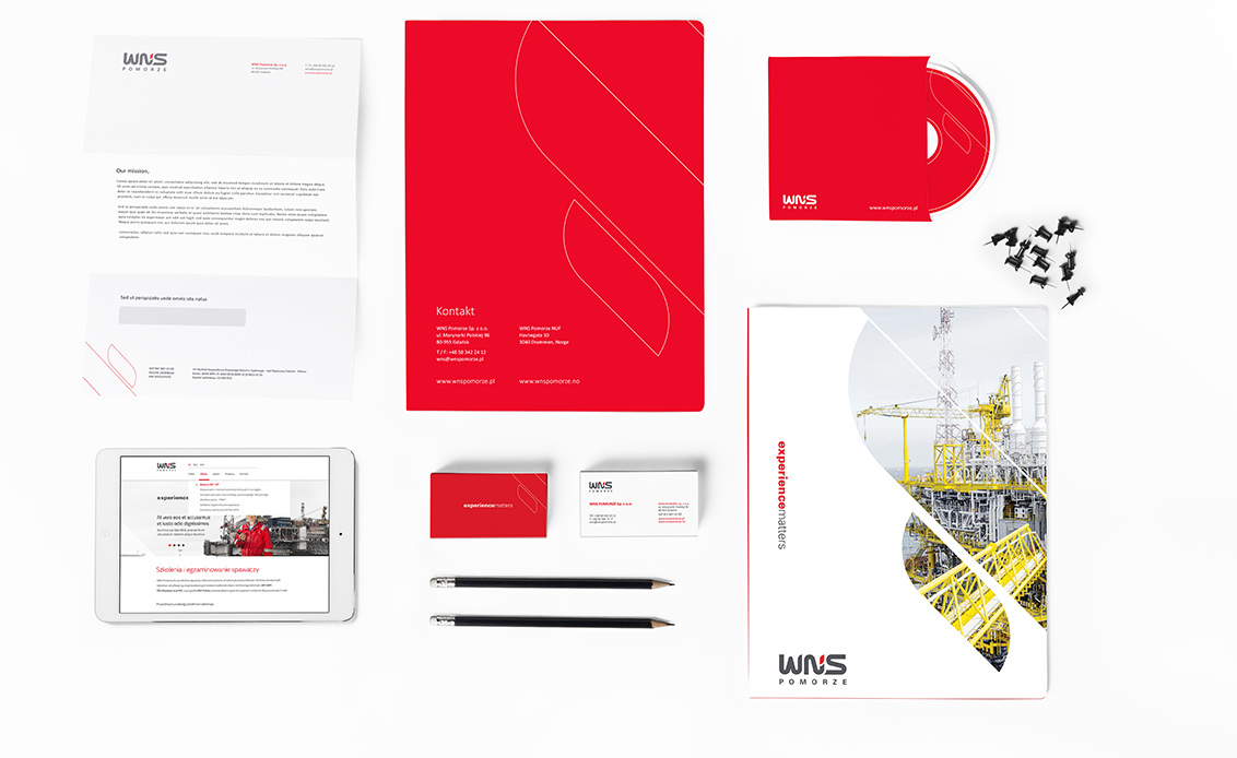
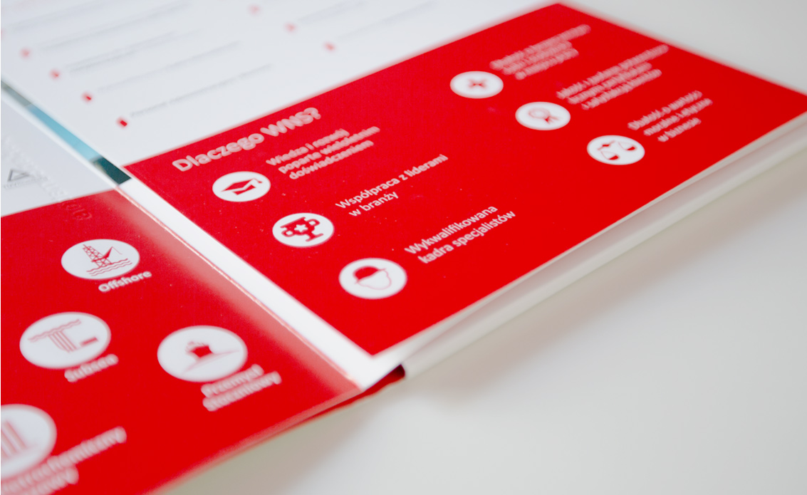
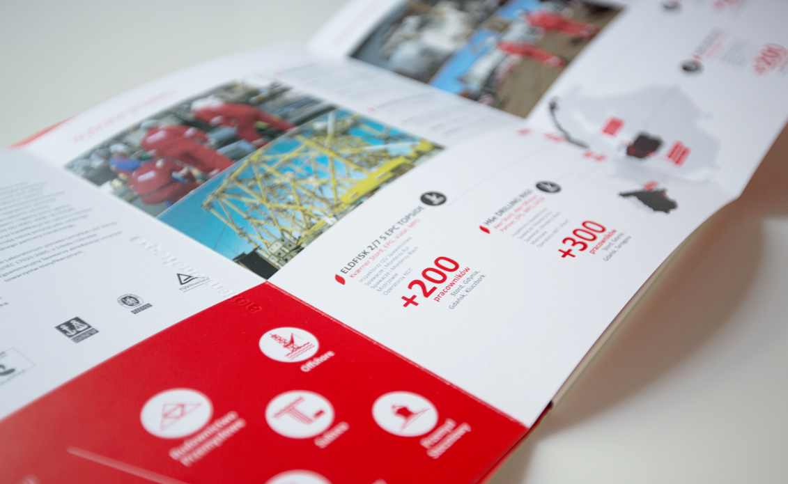
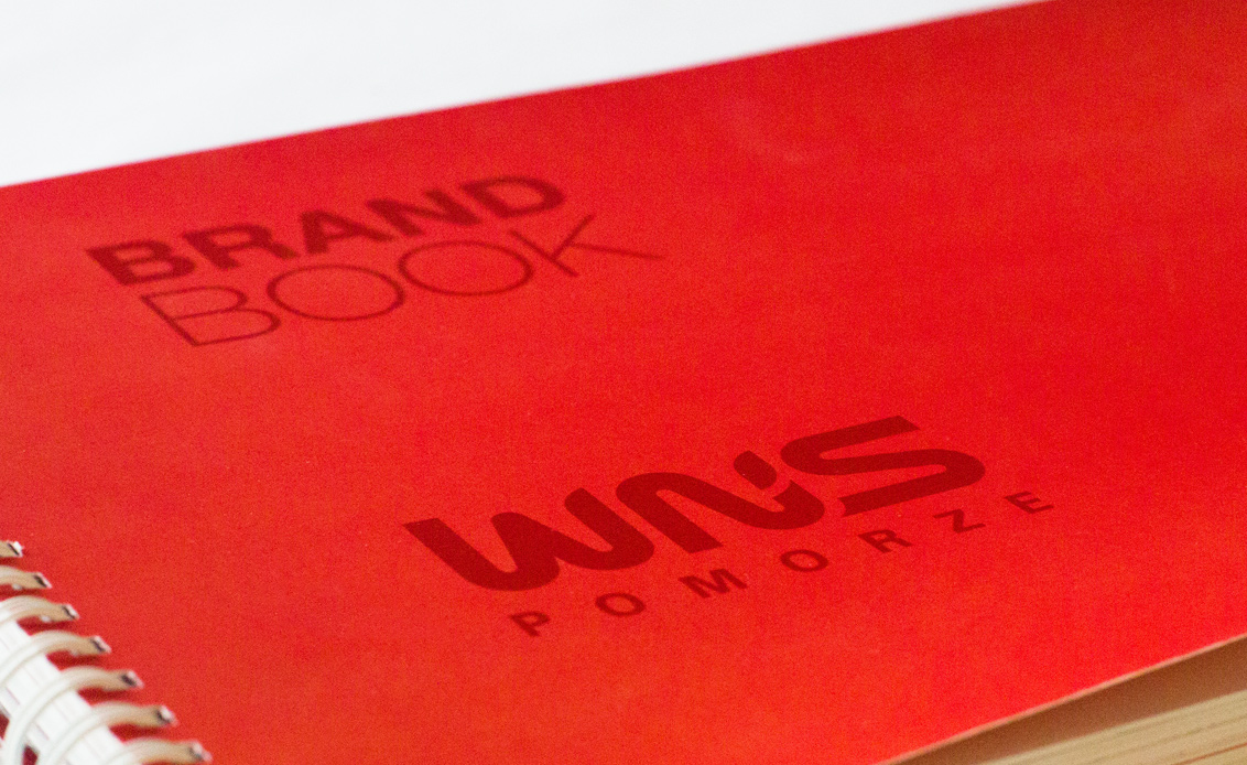
Visual identity system has been defined in an extensive Brand Book, ensuring a coherent brand image for different devices and media.
Our agency developed a comprehensive rebranding plan. We delivered visual communication solutions, creative design and marketing materials. Developing a unique communication strategy and a well thought-out visual identity enabled the company to successfully expand into international markets.
We also designed a special label on the occasion of celebrating 10 years in business.